Site Announcements

  • Account registration restricted. Email lord.ixzion AT gmail.com and I will get you set up. Thanks.
  • RPGMM Discord Channel - https://discord.gg/YJnAfVr

  • New to the site? Let us know!! - Check here.
  • RPGM Magazine Mission Statement. - Check here.
  • We now have a forum up specifically for the races, check it out. - Check here.


[Continue]

It is currently February 24th, 2025, 12:43 pm
View unanswered posts | View active topics


All times are UTC - 5 hours [ DST ]


Post new topic Reply to topic  [ 14 posts ] 
Author Message
PostPosted: December 24th, 2006, 4:12 pm 
Rank 11: Sexy Black Mage Rank 11: Sexy Black Mage
Spotted Skunk/Dragon
Offline
User avatar

  Level 158
 

Joined: May 18th, 2005, 4:18 pm

Posts: 7289

Location: <- That Way ->
I asked this in my Dev. Studio, but seeing as nobody said anything and I need opinions, I'm asking here, where hopefully more people will see and give opinions.

I've been trying to come up with a logo for the dragon slayers in Slayers' Reign. Something simplistic. I'm having a little trouble, though. This is the best I can come up with so far. Take a good look at it, remembering that it is a concept design for the logo for the dragon slayers.

Image

Alright, now that you've seen it, what do you see? Can you see the S mirroring itself? Can you see the S and R? Can you see a resemblance to wings, or some sort of bird? And, finally, were you able to see these things before I pointed them out?

An alternate design was putting a sword between the two halves. But then it resembled a Christmas bow to me. Could just be the season we're in, but that's not something I wanted regardless. It also looked like a crown when I adjusted the hilt of the sword higher.

_________________
Image Image
"What if like...there was an exact copy of you somewhere, except they're the opposite gender, like you guys could literally have a freaky friday moment and nothing would change. Imagine the best friendship that could be found there."


Top
Profile  
 
PostPosted: January 7th, 2007, 6:38 am 
Rank 2: Eager White Mage Rank 2: Eager White Mage
Spotted Skunk/Dragon
Offline
User avatar

  Level 0
 

Joined: November 3rd, 2005, 5:28 pm

Posts: 565

Location: Deep In The Bowels of New Jersey
Sorry I missed this!

I have a good excuse (putting a life back together). But everyone else ?

Anyway...

I see an R mirroring itself, but the s is lost on me.

The bottom curve is too different from the top. ("S is for Symmetry... That's Good Enough for Me!) ([/cookiemonsterimpersonation])

I also saw the birdy shape before you mentioned it. But I did not see the s at all.

I hope that helps.

Peace.

_________________
<center>
<b>MOO!</b>
<img src="http://i16.photobucket.com/albums/b41/Rodak/bannr.jpg">
<a href="http://vfxguide.tripod.com/contents.html" target="blank"><img src="http://i16.photobucket.com/albums/b41/Rodak/guide-ad2-sig.jpg"></a>
</center>


Top
Profile  
 
PostPosted: January 7th, 2007, 7:13 am 
Rank 10: Cute Lil White Mage Rank 10: Cute Lil White Mage
At the Scumm Bar
Offline

  Level 50
 

Joined: January 25th, 2006, 2:27 pm

Posts: 5613

Location: CA
i see a scribble.


Top
Profile  
 
PostPosted: January 7th, 2007, 7:33 pm 
Rank 11: Sexy Black Mage Rank 11: Sexy Black Mage
Spotted Skunk/Dragon
Offline
User avatar

  Level 158
 

Joined: May 18th, 2005, 4:18 pm

Posts: 7289

Location: <- That Way ->
It helps in that now I know I was right when I thought it didn't look right. It looked so much better in my head.

_________________
Image Image
"What if like...there was an exact copy of you somewhere, except they're the opposite gender, like you guys could literally have a freaky friday moment and nothing would change. Imagine the best friendship that could be found there."


Top
Profile  
 
PostPosted: January 7th, 2007, 8:20 pm 
Rank 4: Fighter in Training Rank 4: Fighter in Training
Offline
User avatar

  Level 0
 

Joined: August 28th, 2006, 12:09 am

Posts: 1128
I think it might help if you extend the bottom curve out a bit. I'll see what I can whip up in paint as an example.

Image

_________________
はじめまして。真(しん)の冷静(れいせい)です。どうぞよろしく。
hajimemashite. shinno reisei desu. douzoyoroshiku.

http://www.thetruecoolness.com
Are you prepared? Do you believe in the Coolness? Well either way check it out.


Top
Profile  
 
PostPosted: January 7th, 2007, 11:10 pm 
Rank 11: Sexy Black Mage Rank 11: Sexy Black Mage
Spotted Skunk/Dragon
Offline
User avatar

  Level 158
 

Joined: May 18th, 2005, 4:18 pm

Posts: 7289

Location: <- That Way ->
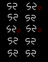
Well whatever I do, it has to work as an RPGM1 sprite. The one I'm showing is an enlarged version solely for showing you guys, since RPGM1 sprites are so small and I don't intend on using a regular title screen. These are more the size that they'll be:
(the current one being the first, on the top-left)

Image

Obviously the ones with open tops I'm not even considering. The one on the bottom-right, I think the top curve ending into a straight line doesn't look very good. I'm partial to the one next to that one, but I'm not sure if I like it curving in so high.

(BTW, I forgot to note, the "S" would be the left half, with the "R" also looking like the "S" mirrored.)

_________________
Image Image
"What if like...there was an exact copy of you somewhere, except they're the opposite gender, like you guys could literally have a freaky friday moment and nothing would change. Imagine the best friendship that could be found there."


Top
Profile  
 
PostPosted: January 9th, 2007, 12:45 am 
Site Admin Site Admin
Rainbow Crash
Offline
User avatar

  Level 89
 

Joined: May 4th, 2005, 7:57 pm

Posts: 10448

Location: VA, mofo
I think the bottom right is the best one there.

_________________
ImageImageImageImage


Top
Profile  
 
PostPosted: January 9th, 2007, 4:05 pm 
Rank 5: Nimble Thief Rank 5: Nimble Thief
Offline
User avatar

  Level 26
 

Joined: January 5th, 2007, 6:05 pm

Posts: 1941

Location: Planet: Trice, City: New Mildas
I think I prefer the one on the right of the second row or the one on the right of the bottom row. Hope that helps.


Top
Profile  
 
PostPosted: January 9th, 2007, 5:37 pm 
Rank 11: Sexy Black Mage Rank 11: Sexy Black Mage
Spotted Skunk/Dragon
Offline
User avatar

  Level 158
 

Joined: May 18th, 2005, 4:18 pm

Posts: 7289

Location: <- That Way ->
Image

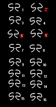
Numbered so that it'll be easier to identify them.
11-16 are new. 11, 13, 15, and 16 are edits of 9. 12 and 14 are edits of 10. 16 is sorta a just-for-kicks deal, and I probably won't have those lines making the wings look more draconic since the dragon slayers are against dragons.

I like 13 and 14. With 14, I'll probably extend the bottom tips just a slight bit so they'd be the length of 13's. My final decision will probably be between these.

_________________
Image Image
"What if like...there was an exact copy of you somewhere, except they're the opposite gender, like you guys could literally have a freaky friday moment and nothing would change. Imagine the best friendship that could be found there."


Top
Profile  
 
PostPosted: January 9th, 2007, 5:40 pm 
Rank 8: Adept Fighter Rank 8: Adept Fighter
Offline
User avatar

  Level 73
 

Joined: May 19th, 2006, 8:42 pm

Posts: 3632

Location: Ohio
Truthfully I can't see any difference in any of them except the ones with the open tops...

_________________
Image Image Image Image


1) Statement 2 is true
2) Statement 1 is false


Top
Profile  
 
PostPosted: January 9th, 2007, 5:41 pm 
Rank 5: Nimble Thief Rank 5: Nimble Thief
Offline
User avatar

  Level 26
 

Joined: January 5th, 2007, 6:05 pm

Posts: 1941

Location: Planet: Trice, City: New Mildas
14 is my fav. Although I like the idea of something in the wings like you have in 16


Top
Profile  
 
PostPosted: January 9th, 2007, 5:56 pm 
Rank 11: Sexy Black Mage Rank 11: Sexy Black Mage
Spotted Skunk/Dragon
Offline
User avatar

  Level 158
 

Joined: May 18th, 2005, 4:18 pm

Posts: 7289

Location: <- That Way ->
facts wrote:
Truthfully I can't see any difference in any of them except the ones with the open tops...

A lot of the differences are pretty subtle.

1 has the roundest "wings".
2 has slightly extended and more frazzled tips than 5 and 6, and a slightly rounder outside joint than 5.
3 has the bottom half of the wing curving upwards instead of downwards.
4 is similar, but has squattier wings and the middle curve curving closer to the inside.
5 and 6, I already compared with 2.
7 has more oval wings than the rest.
8's wings are flat on the bottom.
9, I basically took 7 and pulled the outside edges of the wings down.
10, the outside of the wings is flat.
11 is like 9, except the inside of the wings don't go up as high.
12 is like 10, except the wings are taller.
13 is like 11, except the tail tips are slightly longer.
14 is like 10, except the wings are shorter.
15 is like 11, except the tail tips are a bit more frazzled.
16 is basically 13 with lines in the wings making the wings resemble dragon wings.

Does that help? :)

_________________
Image Image
"What if like...there was an exact copy of you somewhere, except they're the opposite gender, like you guys could literally have a freaky friday moment and nothing would change. Imagine the best friendship that could be found there."


Top
Profile  
 
PostPosted: January 9th, 2007, 6:12 pm 
Rank 3: Studying Black Mage Rank 3: Studying Black Mage
Spotted Skunk/Dragon
Offline
User avatar

  Level 0
 

Joined: December 3rd, 2005, 11:18 pm

Posts: 614

Location: The Land of Nevernear
Of all of these, I guess I would pick number 13. Could you just have a little white line in the center bottom section kinding hinting more towards an 'r'? I just have trouble really seeing it as an 'r' for some reason. Sorry I haven't posted in here before Draygone. Honestly, I didn't really know what to contribute. Now I see a little more about how exactly you want people to respond.

_________________
"I am the Way, the Truth, and the Life. No one comes to the Father but by me."
Jesus


Top
Profile  
 
PostPosted: January 9th, 2007, 6:28 pm 
Rank 11: Sexy Black Mage Rank 11: Sexy Black Mage
Spotted Skunk/Dragon
Offline
User avatar

  Level 158
 

Joined: May 18th, 2005, 4:18 pm

Posts: 7289

Location: <- That Way ->
Nah, if I put a line there, it'd be even more likely to be interpreted as an R mirrored against itself. The symbol is used in the main plot as a mirrored S. The S standing for "Slayers", of course. It's mirrored to resemble wings like a bird, somewhat a symbol of peace. Only for the title is the right half supposed to be seen as an R. SR, Slayers' Reign.

_________________
Image Image
"What if like...there was an exact copy of you somewhere, except they're the opposite gender, like you guys could literally have a freaky friday moment and nothing would change. Imagine the best friendship that could be found there."


Top
Profile  
 
Display posts from previous:  Sort by  
Post new topic Reply to topic  [ 14 posts ] 

All times are UTC - 5 hours [ DST ]


Who is online

Users browsing this forum: No registered users and 5 guests


You cannot post new topics in this forum
You cannot reply to topics in this forum
You cannot edit your posts in this forum
You cannot delete your posts in this forum
You cannot post attachments in this forum

Search for:
Jump to:  
cron
Powered by phpBB © 2000, 2002, 2005, 2007 phpBB Group